Threadomancy!
Look, a cover's been posted!
It's pretty sinister-looking though...  :hides:
Threadomancy!
Look, a cover's been posted!
It's pretty sinister-looking though... :hides:
Darn exciting!
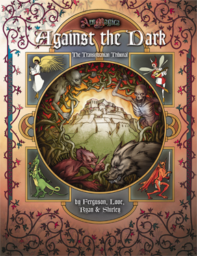
It's transylvania, what did you expect? ![]()
It looks great!
The art of ars magica has really come a long way since the main rule book.
I really love this art...not just because it looks beautiful, but because it suits how I feel about the Tremere so well. An early version I saw of this didn't have the same colouring choices and so it was just a beautiful artwork. This new one, though...the colouring so that Ceoris is this white beacon surrounded by the sinister things and the red of uncoming night - that really works for me, particularly with the rear cover blurb. It captures this slightly - I don't know - this feeling I have that the Tremere want you to think of them as the City On The Hill, and all that implies about you.
It reminds me, in a way, of those pop art posters, not just of Communists, but also the ones the Americans used to print and ship around Japan and the Phillipines. Read on that level, I find it a lot more - disconcerting? - that the old art which was basically "Hey, it's all black and gothic and there are gargoyles on it, because, well, evil...." because it has that slightly more modern feel of "We are the city on the hill", which, for those of us outside America, has always been a mixture of promise (We are really going to do the Enlightenment!) and threat (We know better than you, and think you are corrupt, and will do things our way, and you can't stop us!)
So, I'm really pleased with it, and I'm amazed that in 5th edition, we have a Transylvania cover where Ceoris is the -least- scary thing on the cover, at least to a superficial reading of the image.
And so far as I recall, that potential for layered meaning was never something we decided to put in there. It just emerges from the piece, or at least from my reading of the piece. So, I think that, because of its ability to carry layered meaning, it's a really fantastic bit of art, evebn if you need the Ars context to interpret it.
I can't wait. Although my saga is set in Provence and I can't forsee any reason for them to travel to Eastern Europe, I eagerly devour the tribunal books.
For me, they really fill in the details of the setting, fleshing out and supporting all my more "generic" setting books (LoM, A&A, etc).
The cover is very impressive. It's a bit of a shame that the ars magica trade press takes up so much room that only little is left for the actual picture - I'd have liked to see more of that quality.
The book itself looks very tempting too, of course. I'd definitely buy it... when I have the time to read it... on pdf...
Ok, maybe I'm just tired, but I wanted to thank Mr Ferguson for his (among many others) interesting post, but also for his presence and contribution here. I really appreciate it.
And yes, it feels good not to have the stupid daaaark and x-treme tremere (Of course, this could be a trap to lure you to coeris, the creatures working for the tremere, but I really like the 5th Ed Tremere)
If you read the section of HoH:TL on Tremere, and the section of Against the Dark on the covenant, I believe you will find it is spelled Coeris.
I think you actually managed to fix it before turnover, as well. ![]()
I also like the cover. I think I'd have preferred slightly different wavy lines above Coeris, so that it looked like it was radiating, rather than burning. But that's minor. I think the layered meaning was deliberate, though. (And I'm glad at least one of the authors thinks that the back cover text does what it was supposed to.)
Gang...David's back. Break's over...
In doing Hermanus for Legends of Hermes I thought a great deal about what Coeris might be like. I made a great deal that didn't make it in to the chapter for not wanting to restrict future authors when they wrote about it. (My chapter was at least aiming to be about something for PC's to uncover and investigate not about how one can interact with the Domus Magnus).
I read Timothy's treatment in Houses of Hermes lots more than twice and tried hard not to contradict it. I'm eager to see how the covenant is portrayed now that it gets looked at a third time. I hope that it comes out a bit different than my vision of it, it would be a shame if new minds didn't take it in new directions.
I guess there's no chance of us seeing this one day?
Even if it never becomes official, it still might prove inspirationnal, IMO, or even just entertaining reading, so I, for one, would be interested by it.
Seconded.
i would be delighted 
By the way, does anybody knows when are we going to see the table of contents? I would love a sneak peek 
Any word on what's happening with this?
The preview pages still seems set for a December release, but at this point Atlas will really have to hop if they're still planning to meet that particular deadline...
Here's hoping that it's on a ship from the printer already and in my needy and greedy hands sometime in January. 
When I checked Amazon a couple days ago, it said December 28.